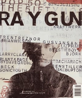
 Fads come and go, trends wax and wane. No ideas ever really die, they simply leave our collective favor for a period of time that is determined by how tiresome they became when in vogue. Design wonks, like me, are asking the same question more and more often. Is Grunge (or Grunge Design) dead? Business owners or those who are responsible for procuring design work for their employer, may well be asking “what the heck is Grunge?” and “why should I care if it’s dead?”.
Grunge Design began in the early ’90s. We have seen the groovy design of the ’60s, the tragedy that was the 70’s and the tight mechanical design of the ’80s. The 90’s “youth rebellion” of choice was Grunge. Heavy textures taken from urban walls, distorted pictures, and madly arranged typography was the staple of Grunge; all facilitated by the rise of the computer. Torn brown paper and graffiti were now high style. Ray Gun magazine and its designer/creator David Carson were at the vanguard of this movement. David Carson said, “…never mistake legibility for communication”. In short, that is what Grunge is all about.
 Instead of neat blocks of text, Grunge allows the sentences to flow and express the emotive character of the text itself. Pictures no longer had to be simple illustrative devices to reinforce the written message. Instead, the picture or image took on its own emotional message. Communication was king and legibility was a secondary consideration at best. Grunge felt new and bold. Much like the Modernists and Deconstructivists of the ’30s and their rebellion against the European aristocratic establishment, Grunge was a response to the conservative and rule-bound design ethic of previous decades.
If you are looking for the culprit in all this, look no further than the humble computer that sits in front of you right now. Not so long ago, graphic design was an arduous time gobbling task. A poster could and often did take weeks to finally get it to press. Magazines took teams of people (far larger than today) to get to the newsstand. I learned graphic design in the era when artistry and the deft use of ink and pen were indispensable tools. The computer, and more recently the internet, didn’t eliminate the need for artistry (bad design is still bad design), but it did almost eliminate all the work that graphic designers and illustrators used to do by hand. Grunge design was the first beneficiary of this new tool. Designers were like giddy, sugar-dosed children with a bucket of paint. The ability to add textures and distortions to photographs quickly combined with instant on-screen satisfaction was more temptation than graphic designers could refuse. For too long, designers had embraced (or adhered to)  the clean and perfectly ordered requirements of clients and agencies. With the computer and available software, designers could now get raw and dirty with gusto.
So, is Grunge dead? Simply, no, but its uses are best confined to skateboard or snowboard ads and apparel. Otherwise, it does really need a nap. As I said at the start, trends come and go and this one is no different. It’s not even all that different from the last time design and designers rebelled. In a few years Grunge will come back, renamed, repackaged, all rested up and ready to be the new “rebel”. 
 Max Swenson is the Graphic Designer and Animator for Idaho State University’s Office of WORKFORCE TRAINING.

.png?width=220&name=Do%20You%20Pocatello%20Podcast_%20(1).png)
