.png?width=220&name=Do%20You%20Pocatello%20Podcast_%20(1).png "Do You Pocatello Podcast_ (1)")

 Yeah, I said it! Right now, a fair percentage of readers are shrugging their shoulders in utter apathy. A small percentage are irked by my grand statement and the remaining, very small percentage of readers, are considering the extent to which they agree. The root of this post is that all fonts have, in designer parlance, voices. What we mean by voice is visual character. While this may seem trivial, I can assure you it’s not. The wrong font choice can destroy an ad’s credibility and reflect very poorly on the company or organization connected to that choice. I’m getting ahead of myself here; first, let me explain the origins of Helvetica briefly, then I will move on to describe and illustrate how font voice is a topic worthy of your attention.
 Helvetica was designed by Max Meidinger and Eduard Hoffmann in 1957 for the Haas Type Foundry (a Swiss subsidiary of the German Linotype Company) and was originally called Neue Haas Grotesk. The development of Helvetica is almost inextricably linked to the Swiss design style. Swiss Design, or the International Typographic Style, was a response to the growing dissatisfaction with the perceived Aristocratic hierarchy of society in Europe. Swiss and Helvetica were intended to be the democratic design style; a design style for “every man.” It was devoid of flourish and ornamentation, the focus being on readability rather than character, which explains why it is the most commonly used font in public signage and the logos of large corporations.
![]()
You may well ask, “So, how does Helvetica suck?” The designers of Helvetica did their job very well. This font is highly readable and without the decorative trappings of other fonts. Therein lies the problem. In their attempt to design a font that speaks to everyone, they designed a font that speaks to everyone but says nothing while doing it. Helvetica is the ultimate non-committal font. If your aim is to avoid any chance of arousing an emotional response, Helvetica will be 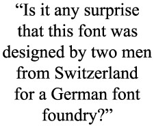.jpg?width=152&height=127&name=helvetica-pull-quote2_(1).jpg) your font of choice. If your goal is to look stoic and absent opinion, you will find Helvetica suits your needs to perfection. Is it any surprise that this font was designed by two men from Switzerland for a German font foundry?
your font of choice. If your goal is to look stoic and absent opinion, you will find Helvetica suits your needs to perfection. Is it any surprise that this font was designed by two men from Switzerland for a German font foundry?
Let’s move on to the real substance of this post; the voice (or character) of fonts. As I stated earlier, choosing the correct font is a critical step in any business marketing vehicle under consideration. The accompanying example illustrates this point. While all five of the examples literally say baby, only the fifth example has the characteristics that say, baby. The other four examples either don’t “say” baby or worse, say something unintended about the baby. These characteristic associations may not be at the front of our minds, but they do lead inevitably to viewer confusion and therefore discomfort. Obviously, confusion and discomfort are not the typical goals of marketing. A good rule of thumb (which can and should be broken if it doesn’t suit the design) is to use no more than three fonts on any given document; one for the head, one for the sub-head, and one for the copy or text. If you are lucky enough to have a skilled graphic designer(s), trust their judgment. Good designers will put your advertising needs and company’s reputation above their personal taste.
Finally, your (or your designer’s) font choice is an important one. Your impression and your gut will tell you if you are on the right path. Most of all (more important than your gut even), pay attention to the fonts you choose and you will be rewarded with marketing material that is more likely to be read by the consumer.
 Max Swenson is the Graphic Designer and Animator for Idaho State University’s Office of WORKFORCE TRAINING.
